.png)
Good lighting changes how a Canvas Print, Wall Art, or Art Print reads in a workspace. When the beam is too harsh, reflections pull attention away from the Artwork. When the color temperature is off, Paintings can look dull or oddly tinted. And when fixtures are placed without a viewing plan, a beautiful Wall Decor piece can turn into a bright patch you avoid looking at.

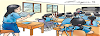
This guide is built for real work zones: for Office, for Home Office, for Meeting Room, and for Hallway. You will learn how to reduce glare, choose a Kelvin range that fits the job your room needs to do, and place lights so Wall Hangings stay comfortable to view from desks, chairs, and walkways.
Quick start: three rules that solve most office art lighting issues
- Aim to miss the viewer: set the beam so any reflection bounces away from the usual viewing path (desk chair, meeting table, entry route).
- Pick one main Kelvin “family”: keep your ambient and art lights close in tone so the Art Picture does not shift color from one wall to the next.
- Light the whole piece, not the center: match beam width and distance to the size of the Art Canvas, especially for Large Wall Art and Extra Large Art.
Anti-glare basics: why reflections happen and how to stop them
What causes glare on Wall Prints and framed Art Prints
Glare is not only about brightness. It is mostly about angle. A small, strong source (like a bare downlight) can reflect straight back to the eye if the light, the artwork, and the viewer line up. Glass fronts and glossy finishes make this more noticeable, but even matte surfaces can shine when the angle is wrong.
Start with a simple check before you buy anything. Stand where you normally view the piece (at a desk chair, at a meeting table, or in the hallway). Then slowly move a phone flashlight around the room. The spot where you see the strongest reflection tells you which angles to avoid. This one minute test often saves you from installing a light in the exact place that will cause the problem.
Anti-glare moves that work in most workspaces
First, change angle—not power. A softer, off-axis beam usually looks better than a brighter, direct hit. If your office has windows behind the viewing position, add simple light control (blinds or sheers) so daylight does not bounce off the surface during peak hours.
Second, make the source “bigger.” A shaded picture light, a diffuser, or a wall washer spreads light so you do not get a sharp hotspot. Third, check the viewer’s height. A plan that looks fine when you stand may create a streak when you sit. If seated viewing is the main use, set the light so reflections travel above seated eye level.
Kelvin made practical: choosing a color temperature that fits office work
Recommended Kelvin ranges for office Wall Art
Kelvin (K) is the “warm to cool” scale of white light. Warmer settings feel softer. Cooler settings feel cleaner and more task-focused. In most offices, the best results come from staying in a neutral band and keeping the whole room consistent.
Use these ranges as a starting point, then match them to your existing ceiling lights:
- 2700–3000K: softer light for lounge areas, waiting zones, and a private office that should feel calm.
- 3000–3500K: balanced light for mixed-use rooms, shared desks, and reception walls.
- 3500–4000K: crisp light for task-heavy zones and meeting spaces where clarity matters most.
Color accuracy: what to look for beyond Kelvin
Kelvin tells you the tone of white light. CRI (Color Rendering Index) tells you how well colors show under that light. For Artwork with fine color shifts—like Paintings-style prints, photography, and Modern Art—high CRI helps colors look steady. If you can, choose LEDs rated 90+ CRI for art lighting.
If you are selecting pieces for professional walls under neutral LED light, graphic and clean compositions often read well at desk distance. For office-ready options, explore the Office Wall Art Canvas Prints Collection and choose Wall Prints that stay clear even when seen in passing.
Placement that works: angles, distance, and fixture choices
The core aiming method you can repeat
A reliable starting point is a 30°–35° beam angle from the wall. This often reduces reflections while still giving your Canvas Print depth. If you see a reflection when you sit down, raise the angle slightly or move the fixture so the reflection travels above the seated eye line.
Distance from the wall controls coverage. The closer a fixture is to the wall, the smaller and harsher the light patch becomes. Step it back so the beam spreads to the edges. This matters most for Large Print and Large Art Print pieces, where dark edges can make the image feel smaller than it is.
Three fixture types that suit Office Wall Art
You do not need a gallery build to light Wall Decor well. These are the most common solutions for work walls:
- Track heads: adjustable aim helps when you move furniture or rotate Artwork during the year.
- Wall washers: even light for long walls, grouped Wall Hangings, or a hallway gallery line.
- Picture lights: a clean look for one centerpiece above a desk, console, or small meeting nook.
Placement planning: measure viewing, not only wall size
Before installing, measure the wall height, the artwork height, and the main viewing positions (desk chair, visitor chair, meeting table). Then pick one “primary view” for each piece. In a for Office setting, the primary view is often seated. In a for Hallway setting, it is usually standing and close.
If the room includes screens, plan the art light and the screen sightline together. A beam that misses the artwork glare might still bounce into a monitor. Aim to keep reflections off both surfaces by shifting fixtures left or right and using wider, softer beams.
Lighting setups by space (rooms and work zones)
for Office and for Offices
In shared offices, keep the ambient light steady and add a gentle accent for your Wall Art. Avoid aiming beams toward glossy whiteboards, glass partitions, or screens. When you keep the wall light softer than the task lighting on desks, the room feels balanced and the wall stays easy to view.
If you prefer clear themes that fit work culture—goals, planning, growth, and leadership—browse the Business Concept Canvas Prints Collection and pick Artwork that still reads well under neutral light.
for Home Office
Home offices often have a camera view to consider. Place the art light so it does not create a bright streak behind your head in video calls. If your desk faces the wall art, keep the fixture off to one side so reflections do not land in your direct line of sight.
If the room has a desk lamp, let the desk lamp handle task lighting and keep the wall light broader and softer. This prevents the wall from turning into the brightest area in the room while still keeping your Art Print visible on camera.
for Meeting Room
Meeting rooms are tricky because people view the wall while seated at many angles. Use wall washers or track lights aimed high enough that reflections pass above most eye lines. Keep Kelvin aligned with the room’s main lighting so the wall does not shift tone when you dim lights for presentations.
If the meeting space includes a display, avoid placing a tight spot directly above it. Instead, spread light along the wall so the screen stays readable and the artwork stays visible without glare.
for Hallway and for Entryway
In hallways and entry areas, people stand close to the wall, so hotspots feel stronger. Use broader beams, indirect light, or washers that spread light evenly. Keep fixture spacing consistent so the wall feels calm as you walk.
For long corridors, group several smaller Wall Prints and light the group as one layout rather than blasting each piece with a tight spot. This looks cleaner and usually takes fewer fixtures.
Choosing Office Wall Art that looks good under LED light
Lighting and subject choice work together. High-contrast designs read well at a distance and stay clear in peripheral vision. Soft, low-contrast images can look muted under very cool light. If your office uses a neutral Kelvin range, you have more freedom to choose from Modern Art, graphic prints, photography, and paintings-style images.
Think about scale. A small Art Picture can look lost on a wide wall, even with strong lighting. Large Wall Art often feels calmer because it needs fewer separate light sources. If you prefer a gallery layout, keep spacing even and set one continuous washer line so the set reads as one composition.
Routine care for Canvas Prints and Wall Hangings in work spaces
Office air can be dusty, and HVAC flow can push fine particles toward walls. Use a dry, soft cloth or a clean duster to remove surface dust from Canvas Print edges. Avoid wet cleaners on printed surfaces unless the product care guidance says it is safe.
Also check heat. Keep high-output fixtures far enough away that the surface does not warm noticeably. Modern LEDs run cooler than older bulbs, but distance and airflow still matter for long display periods.
FAQ: Lighting for Office Art
1) What Kelvin is best for Office Wall Art?
Most offices look best with 3000–3500K because it feels neutral while still showing color clearly. If the space is task-heavy, 3500–4000K can also work.
2) How do I reduce glare on framed Art Prints?
Start by changing the angle. Move the light source off to the side and aim it so reflections bounce away from your main viewing position. Non-reflective glazing can also help.
3) Is track lighting a good fit for Canvas Art?
Yes. Track heads are useful when furniture moves or when you rotate Wall Decor. Choose a wider beam for bigger pieces.
4) Should I use a picture light or a ceiling fixture?
A picture light gives a clean “one piece” solution. Ceiling fixtures are better when you want one lighting plan for several Wall Prints along a wall.
5) How many lights do I need for Large Wall Art?
It depends on beam spread and distance. Many large pieces look best with a wider beam and one or two fixtures placed far enough back to cover the edges.
6) What aiming angle should I start with?
Try 30°–35° from the wall, then adjust based on where you sit or stand when viewing the Artwork.
7) Does higher wattage fix glare?
No. More brightness can make glare worse. Fix angle and diffusion first, then adjust brightness.
8) What CRI should I look for?
For Artwork, 90+ CRI is a strong target. It helps colors look steady and natural.
9) Can daylight ruin my lighting plan?
Daylight changes through the day, so it can create reflections. Window coverings and off-axis aiming help keep the wall more consistent.
10) Will cool light make Paintings look blue?
It can, especially if the piece has warm tones. Keep the room consistent and avoid mixing very warm and very cool lights in the same space.
11) What is a wall washer?
It is a fixture designed to spread light evenly across a wall. It is useful for long walls and grouped Wall Hangings.
12) How do I light a set of three Wall Prints?
Treat the trio as one display. Use a single wider beam or a washer line so all three pieces share a similar light level.
13) Can I light office art without drilling?
In some setups, plug-in picture lights or clamp lights can work, but aim and glare control still matter. Keep cords tidy for a professional look.
14) What if the art is near a monitor?
Keep beams away from the monitor’s reflective surface and reduce contrast between the screen and the wall by using a softer art light.
15) What is the fastest way to check for glare before installing?
Use a phone flashlight and stand in the main viewing spot. Move the light around until you see the reflection, then plan to place fixtures away from that path.
Final checklist before you light your office wall
Set one Kelvin range for the room, pick high-CRI LEDs, and aim lights so reflections miss the viewer. Then choose a beam and distance that cover the full Canvas Print. When the wall looks calm and readable from where people actually sit, your Office Wall Art becomes part of the workspace rather than a distraction.


0 Comments